

 Z
Z
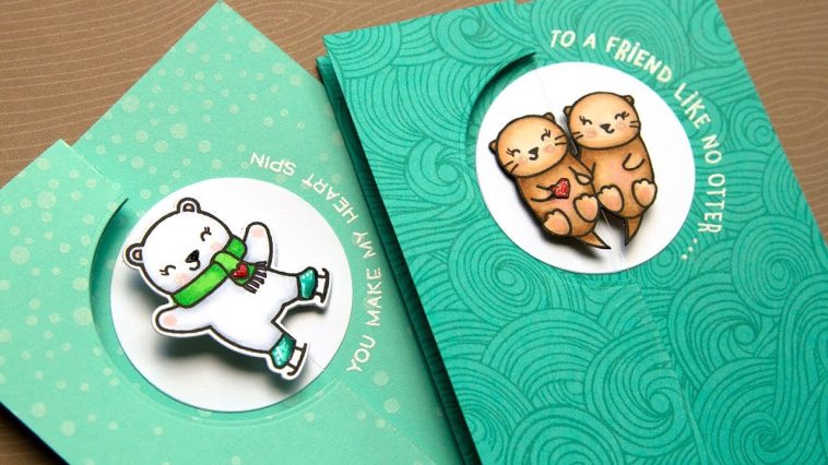
I’ve always loved the elegance that comes from simplicity. In a world overflowing with color, texture, and visual noise, creating something clean and refined can feel like a breath of fresh air. When it comes to handmade cards, going minimalist does not mean going plain. In fact, knowing how to design minimalist handmade cards opens up a world where every detail is intentional and every element has a purpose.
Minimalist cards can express any emotion, gratitude, celebration, love, sympathy, with a quiet confidence that doesn’t shout but speaks straight to the heart. Whether I’m sending a birthday greeting, a wedding congratulations, or just a note to say hello, I often find myself reaching for a minimalist design. It’s not only timeless but also surprisingly versatile.
In this article, I’ll walk you through how to design minimalist handmade cards from start to finish. Whether you’re new to cardmaking or a seasoned crafter looking to embrace a more understated style, the process is calming, inspiring, and always rewarding.
What Makes a Card Minimalist
Before diving into materials and techniques, it helps to define what makes a card minimalist. To me, minimalist handmade cards are characterized by a few key qualities:
- Clean lines and uncluttered layouts
- Limited color palette, often using neutrals or monochrome
- Thoughtful use of white space
- Simple shapes, fonts, or messages
- Purposeful design choices with no unnecessary embellishments
Minimalist cards often let one or two elements shine. Whether it’s a single stamped word, a delicate hand-drawn icon, or a striking geometric pattern, the focus remains clear and strong.
Materials for Minimalist Cardmaking
Minimalism often relies on restraint, so I limit myself to just a few tools and supplies. Here are the essentials I use when figuring out how to design minimalist handmade cards:
- Blank cardstock, usually in white, cream, or kraft
- Black ink and one accent color (optional)
- Fine-tip pens or markers for drawing
- One or two clean stamps or stencils
- Washi tape or thin strips of paper
- Paper trimmer or craft knife
- Bone folder for crisp folds
- Adhesive roller or glue stick
- Optional: embossing powder and heat tool for texture
While I sometimes add an embellishment or two, like a stitched edge or a tiny brad, I’m always careful that it complements the simplicity rather than overwhelming it.
Layouts That Work Well
Simple layouts are the backbone of minimalist cardmaking. I usually start by sketching a few layout ideas using pencil and scrap paper. Some of my favorites include:
- Center-focused design: one image or message right in the middle of the card
- Rule-of-thirds placement: placing the focal point in the lower-right or upper-left quadrant
- Vertical strips or panels: using slim vertical shapes or stripes for balance
- Negative space highlights: letting the empty space serve as the design element itself
When designing, I always ask myself, what can I take away and still convey the message? If something doesn’t serve the overall effect, I leave it out.
Using Color Intentionally
Color is powerful in minimalist design, which is why I use it sparingly. I almost always start with a base of white or off-white and build up from there. Black ink or gray text adds clarity, while a single pop of color adds emotion and personality.
For example, I might stamp a small red heart on a thank you card or use a navy blue stripe on a sympathy card. The trick is to let the color guide the emotion without taking over the whole card.
When I do use patterned paper, I stick with subtle prints, thin stripes, soft textures, or watercolor washes that blend well with the clean aesthetic.
Incorporating Typography
Fonts and letterforms play a central role in minimalist cards. A beautifully placed word or phrase, even in simple handwriting, can carry the entire message. I often use the following techniques:
- Stamp a clean, serif or sans-serif word in the center
- Handwrite a short sentiment using a fine-tip pen
- Print and trim typed phrases in all caps
- Emboss a single word with white powder on black paper for contrast
Messages like “thank you,” “love,” “hello,” or “you’ve got this” can say so much when placed deliberately and uncluttered. I experiment with alignment, left, centered, or offset, to create subtle visual interest.
Simple Techniques That Add Texture
Even in minimalist design, texture can bring depth and elegance. I use a few techniques that add tactile interest without disrupting the clean lines:
Dry Embossing
Using an embossing folder or scoring tool, I create subtle raised patterns like stripes, dots, or frames. These add shadows and dimension while remaining monochrome.
Heat Embossing
One of my favorite ways to add texture is heat embossing a single stamped word. A glossy white sentiment on kraft paper looks sophisticated and refined.
Layered Paper
I sometimes mount a small square of colored cardstock or vellum behind a stamped word to give it a slight shadow and make it stand out. Using foam tape adds even more dimension.
Ideas for Different Occasions
Minimalist cards can suit almost any occasion. Here are a few card types I love making with this approach:
Thank You Cards
A simple “thank you” stamped in the center with a delicate border or underline is always elegant. I might use cream cardstock with black text and a tiny dot of gold ink to finish it off.
Sympathy Cards
Soft gray tones with a single stamped leaf or abstract shape offer a respectful and soothing design. I keep the text small and let the space speak for itself.
Birthday Cards
One vertical candle stamped in black with a tiny flame of yellow or orange says “birthday” without needing balloons or confetti. A line of hand-drawn dashes underneath can look like stitching or ribbon.
Wedding or Anniversary Cards
I love creating understated romantic cards using white on white textures, a simple intertwined heart, or the couple’s initials. They feel refined and personal.
All-Occasion or Blank Cards
A minimalist design doesn’t have to be tied to a message. Sometimes I make sets of blank cards with abstract geometric designs, allowing the recipient to decide how to use them.
Keeping the Inside Simple
I like the inside of my minimalist cards to match the exterior. I’ll often stamp a small icon in one corner, add a short phrase in light gray, or leave it completely blank.
When I write messages by hand, I take time to space my lines neatly. It’s amazing how thoughtful penmanship can elevate the design further.
Mistakes to Avoid
Minimalism might seem easy, but it takes care and discipline. Here are a few lessons I’ve learned while learning how to design minimalist handmade cards:
- Avoid using too many elements at once, less is more
- Be cautious with adhesives, as glue marks or tape show easily
- Keep your hands clean when working with white paper
- Align elements precisely, crooked stamps or cutouts stand out more on minimalist cards
- Resist the urge to add one more thing, even if the space feels “empty”
With practice, I’ve come to love the quiet balance of a well-executed minimalist card.
How I Plan a Card from Start to Finish
Each time I sit down to design, I follow a general flow:
- Pick the occasion and message
- Choose my cardstock base and color scheme
- Sketch or plan the layout with simple shapes
- Stamp or draw the main image or text
- Add subtle texture or embellishments
- Mount everything with care
- Check alignment and clean up any smudges
- Write or stamp a matching message inside
Sometimes I make a few variations of the same design in different colors or sizes. This helps me refine the layout and build a small collection of ready-to-go cards.
Gifting or Selling Minimalist Cards
Minimalist cards make wonderful gifts, especially in sets. I bundle five or six into a simple kraft paper sleeve or tuck them into a handmade box with a ribbon. If you sell your cards, minimalism stands out beautifully in markets and online shops. People are drawn to the elegance and thoughtfulness of the design.
Adding a label or insert that explains your handmade process also adds value and appreciation for the work you put into each piece.
Final Thoughts
Learning how to design minimalist handmade cards has changed the way I approach creativity. It’s no longer about filling space but about giving each element room to breathe. The results are calm, meaningful, and visually striking in their simplicity.
Minimalist cards can say a lot with very little. They let your care and effort show without shouting. If you’re feeling overwhelmed by too many tools, colors, or ideas, this might be the perfect style to explore. You’ll find that by doing less, you actually connect more.
Next time you sit down to create, I invite you to simplify your supplies, slow your process, and let the quiet beauty of minimalism lead the way. Whether you’re making one for a friend, a loved one, or just for yourself, the joy is in the details and the intention behind every line.


GIPHY App Key not set. Please check settings